
Uncategorized

Logo/Branding
Live Project, Social media, UncategorizedLogo’s are vital for recognition and putting a stamp on your work, and for customers to be able to familiarise themselves with your work.
Logo Thorns on Instagram is a selection of top quality, renowned logos. They are immediately eye catching, with use of block colours, simplified details, and a clear focus point. Many of them use the Gestalt theory of closure, or figure and ground to convey an image. These work by tricking or convincing the mind towards what it is seeing.


For my logo design I began by simply using the idea of the pencil shape to begin with as my work is currently based on hand drawings.I arranged them in a circle which from a distant creates a coherent shape as opposed to looking like a group of individual objects.


I then recreated this using Adobe Illustrator, I chose Illustrator to design it as it is more suitable for drawing, and then Photoshop for converting the images for web use. I started the design by creating a triangular shape, for this i selected the star tool, and by clicking on to the artboard which is the white page you are working on, and selecting 3 points instead of 5.


I then adjusted the points on the straight edge to create the zig zag edge. By adding anchor points you can move these points to different places altering the shape.
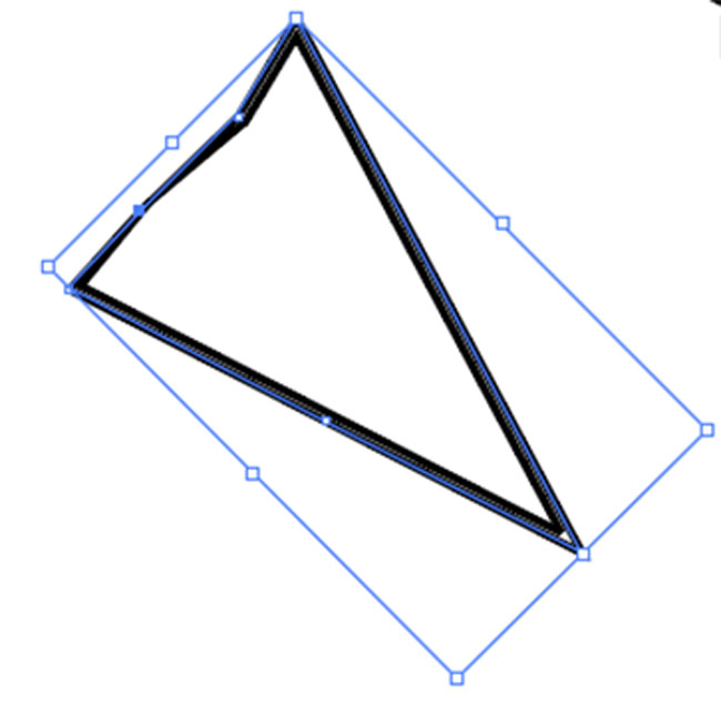
Editing anchor points
When creating the second part, I began in the same way by creating a rectangle shape and adding in the lines after. By using the tool ‘Horizontal Distribute Centre’, the lines within the shape are equally spaced. For the led part of the pencil i created another triangle shape as before but increased the line thickness until it was filled with colour.


I could then use the transform tool to copy the image in the opposite position, I then selected and rotated this image until i had the complete circle.

Social Media
Digital Applications, Social media, Uncategorized
Social Media is an extremely powerful tool and used globally across many platforms. When promoting work or a brand it is vital to get it right in terms of presenting the work with a clear navigation and accessibility for users. Viewers need to be guided directly to the key purpose of your work and should not have to search around a website or app in order to find things. Connecting different social media platforms is also very important, this allows the viewers to be guided in ways which explore the work further and find more information about the brand or artist.
On my WordPress site I edited the menu to link to my Instagram, where there is further images of ideas and work that has been done in the past. It makes the work more accessible to a wider audience as everybody has preferences over which social media platform they use regularly, so it benefits the artist and viewer. The images on my Instagram are taken using my iPhone 5s, another form of modern hardware, and using Instagram as software allows me to manipulate the images to create a more interesting presentation.
Being able to transfer the idea of luxury onto an online platform can be highly beneficial, with precisely thought out presentation of images and design aspects, a website or even Instagram page can look luxurious. To be able to portray this online to audiences is going to sell or promote your work in certain directions, so when I create my own professional website to sell my work I will consider this carefully, down to the colour schemes, typeface, and image layout.

Menu on my blog with link to Instagram

Screen Print for Notebooks
Live Project, Screen print, Uncategorized
In preparation for screen printing onto card to become notebooks, I chose a few designs to begin creating stencils onto a large fine mesh screen, the fine mesh is important for this project as the lines Im working with are finely detailed and I want this to be transferrred. Here is my screen with many different layers for three designs, the most layers I am working on to begin with is five on one print, as I don’t want to over complicate it before I have practiced and tested what works.
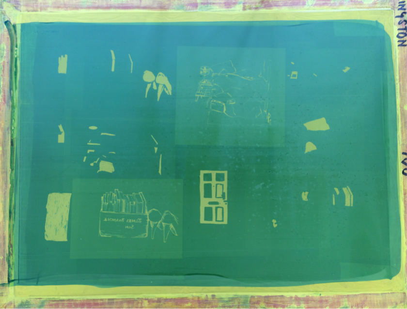
The screen in progress
Screen printing is a skill I am learning and practicing on the job, with only a little bit of experience under my belt, it takes patience and precision. Colour mixing can be done in advance and is useful to prepare all the colours so you are ready to do as many layers as possible in one session.


Postcards or Greeting Cards
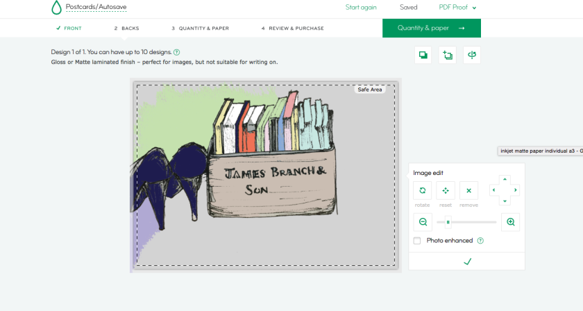
Digital Applications, Live Project, UncategorizedMoo.com is a website that can be used for printing professional designs onto business cards, postcards etc. Here you can see how simple it is to upload your own design on to the postcards, they allow you to have different designs within an order so I can choose my best designs and purchase a group of 20/50/100 with a matte or gloss finish. It also allows me to have a logo design on the front.
Photoshop Edited Drawings
Digital Applications, Drawing, Live Project, UncategorizedThese are my first two attempts at editing drawings on Photoshop, by simply filling in colour it accents certain elements and creates a mood.


As I did more of these I learnt how it worked and could draw more purposeful lines. The way the colour filters through different sections where two ends don’t quite meet creates some interesting outcomes, and presents a more thought provoking image, so I was much more aware of the way I was drawing the original images to use the colour editing successfully. The drawings are mostly of a domesticated subject matter, I attempted drawings of other environments but didn’t find it as appealing; perhaps due to the personalised, intimate aspect of my own belongings and habitat.


I experimented with presenting my drawings as grouped pieces. I started to see a theme emerge among the colours being used and thought of the option to have a range of repeated images.


Scanning/Editing drawings for Screen Print
Digital Applications, Live Project, Screen print, UncategorizedTo prepare my drawings for screen print, I used a scanner to import them to the computer and in turn Photoshop for editing.

I needed to remove all the marks on the image such as the paper and leave only the pen design to get a clear image. Using the magic wand tool you can select areas to remove based around your image, using tone and colour it detects and groups areas together. For my images this worked well in removing everything but the black pen.

This left me with a much more accurate image to work from. I also used the levels tool to make the lines darker, this will leave me with clearer lines on the screen.

I then printed this on drafting film, this is similar to acetate but has a matte finish and allows me to put it through a printer, considering i will be working with many different designs it is more time efficient to be able to print my designs in preparation for screen printing as opposed to redrawing each one individually, however the drafting film is quite expensive, around £5 for an A1 sheet.
Research for notebooks
Live Project, UncategorizedMagma is a quirky Art/book shop with a couple of stores in central London and one in Manchester. Ive always been drawn to their individual, contemporary style so looked at their current stock for research for my live project.
Here you can see these purpose built sketchbooks for artists, these come in a range of colours, and inside contain various paper thickness’ and colours, and contain information about certain topics e.g. illustration/fashion, these sell for £8. This is a great example of where minimal personalisation of notebooks sells at a much higher price, even the colours are attractive and could be sold as a set. The labels around the front make them look individual and give further character so this is something to consider.

Below is a print sold in Magma, by Ryo Takemasa. He created a series of scenic screen prints, i particularly like the colours, they are similar to my original ideas and drawings. Also the crisp, neat look you get from a print is very contemporary.

Paris In The Spring Print By Ryo Takemasa
Paperchase is one of the most successful stationary shops in the UK, selling a range of books and gifts.
The leather book below sells for £15, so it proves what using more expensive materials can do, it turns the book into more of an object, something you want to hold and cherish, so using other materials other than paper is something i could explore, however the manufacturing is likely to take much longer.
The brown paper books come in a pack of 3 for £5 at Paperchase, this has potential for me to print my designs directly on to the front cover and sell for a higher price. However, Im yet to decide whether it will be cheaper for me to create my own books.

3 for £5

Sells for £15
Examples expenditure options for my project, looking at making 20 books. If I buy ready made notebooks:

£8 for a pack of 10 from http://www.officestationary.com

£1 per book from Hobby Craft.
Book at est. £1 each
Screen print images directly onto the covers, small cost for paint
Sell at 3.50 each, profit of 2.50 per book
…Plus Packaging?
Making own books:
£4.36 for 100gsm a4 paper (500 sheets) from Post Office – More than enough to make 20 books with 20 sheets in each.
Brown craft paper for cover, £1.50 per 8 sheets, so £4.50 in total
Coloured paper for inside= £5
Est £13.86 to make 20 books
=20 sold for £4.50 = £90
Profit of £75 if all are sold
Climb Every Mountain
Digital Applications, UncategorizedAs our task is to complete a poster for commercial use, I chose to look at a new phrase with basic modular imagery. The phrase ‘Climb every mountain’ is often displayed in a light hearted, uplifting manner, but i realised with my font I could create it with what could be perceived as sarcasm.
To create the idea mountains along the bottom of the page, i used the rectangle tool and adjusting anchor points created various sized triangles, colouring them as i went along.


I then began placing my phrase onto the poster in different ways, and came up with the idea to have the word mountain as if its fallen down from the sky and leaning on the mountains, so it is slightly ironic as it’s opposing its meaning by having fallen.


It felt too dull and I realised I hadn’t coloured the background correctly, so I created a new background using the rectangle tool which brought the light into it. I think aspects of this idea work and it is a good starting point, however it needs to be of a higher quality.

Scanning
Digital Applications, UncategorizedScanning and printing are dynamic and useful tools for artists and graphic designers.
Here I simply printed my typeface design onto a piece of wrapping paper, and immediately it gives it a more appealing look. It adds another dimension, especially seeing as I didn’t colour in every module within the typeface.

I then printed out the first design i created onto a piece of white and pink paper, screwed it up into a ball and reopened it, and scanned it. The way the crinkled paper appears is a great texture once printed and i would definitely consider using this in future work. This could be pushed further if the font was larger, to make the letters appear more disfigured.


